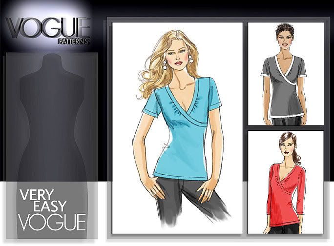
What I dislike about Vogue 8477!
9:30 PM I've been looking for more knit top patterns. You know the kind... easy to make... even easier to put on! I thought about his new one that VP has. BUT, the one thing that bugs me about this top is -- the contrast trim. If you look at the view in the upper right corner, your eye is immediately drawn to the left breast! That is just not a good place to put contrasting. If contrasting is to go there, shouldn't it be on both sides? You know... to add symmetry! Something about this creates a lopsided effect. I know that most women have somewhat uneven breast, but do we really want to draw attention to that? I don't! ROFL I think I still may consider this pattern, but it will definitely be in a solid color.


0 comments